Blog›Build an IMDb Movie Dashboard with SQL and Tableau (Free Beginner Project)
ProjectsTools & Stack
From SQL to an IMDb Movie Dashboard
The perfect first SQL and data project: answer three questions with SQL on 250 top-rated films, then turn the results into a polished, shareable Tableau dashboard. No installs, about 45 minutes.
CR
Conor Robertson
July 22, 2026 · 12 min read
Frequently asked questions
The questions people ask before starting their first SQL and Tableau project.
Ready to practice on real data?
QueryCase teaches SQL through mystery cases on real datasets. Music, sports, film, and more. Your first cases are completely free.
Learning SQL is one thing; having a project to show for it is another. This is that project, and it makes a great first one. In about 45 minutes, using two completely free tools, you will write three SQL queries against real data, then turn the answers into a polished, interactive dashboard you can put in a portfolio and share with a link.
The data is 250 of the highest-rated films on IMDb: their ratings, runtimes, genres, directors and cast. You do not need to be good at SQL yet. Every query is written out and explained in plain English, ready to copy and paste. There is no database to set up and nothing to install, from the first query to the finished dashboard it all runs in your browser.
In the schema panel on the left, select IMDb Ratings (click change if a different dataset is loaded). It is one of the free datasets, so you are ready to go.
You will land on the SQL editor with the IMDb tables listed down the left. That is where the three queries below run.
2. Create a Tableau Public account
This is where you build the dashboard, free and entirely in your browser. No download needed.
That is all the setup. You will build the dashboard in Tableau's browser editor (its web authoring), which you open from your profile in the next section.
One thing to know: it is Tableau Public, not Tableau Cloud (which is paid). Everything you publish to Public is public, which is exactly what you want for a portfolio piece, because it gives you a shareable link.
The plan
Three queries, each answering a different question and producing a file you will use in Tableau.
3 SQL queries3 CSV files1 dashboard
Query 1
The films table
One row per film: rating, runtime, era, director and lead actor.
films.csv
Query 2
Let's build them.
Step 1: The films table (your backbone)
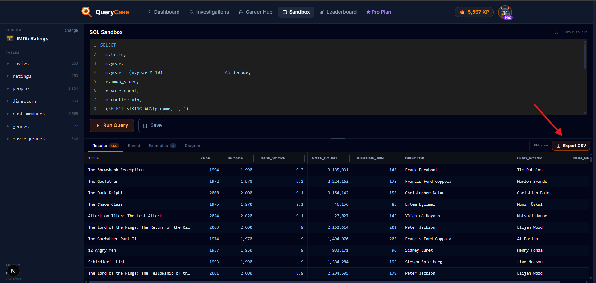
What it answers: everything at the film level. One row per film, with its rating, vote count, runtime, the decade it belongs to, its director, its lead actor and how many genres it spans. This single table will drive most of the dashboard.
Run this in the sandbox:
SQL
SELECT
m.title,
m.year,
m.year - (m.year % 10) AS decade,
r.imdb_score,
r.vote_count,
m.runtime_min,
(SELECTSTRING_AGG(p.name, ', ')
FROM directors d
JOIN people p ON p.person_id = d.person_id
WHERE d.movie_id = m.movie_id) AS director,
(SELECT p.name
FROM cast_members c
JOIN people p ON p.person_id = c.person_id
WHERE c.movie_id = m.movie_id
ORDERBY c.billing_order
LIMIT1) AS lead_actor,
(SELECTCOUNT(*) FROM movie_genres mg
WHERE mg.movie_id = m.movie_id) AS num_genres
FROM movies m
JOIN ratings r ON r.movie_id = m.movie_id
ORDERBY r.imdb_score DESC;
What it does, in plain English: the main query joins movies to ratings. Then three subqueries fill in the columns that need a lookup: the director (joined through the directors bridge table), the top-billed actor (the lowest billing_order in cast_members), and a count of the film's genres. The year - (year % 10) trick turns 1994 into the decade 1990.
You get 250 rows. A few documentaries (like Senna and 20 Days in Mariupol) have no cast in the data, so their lead_actor is blank. That is real, honest data, and Tableau handles it fine.
Now click Export CSV above the results and save the file as films.csv.
Run the query, then hit Export CSV (top right of the results) to download the full file.
Step 2: Films by genre
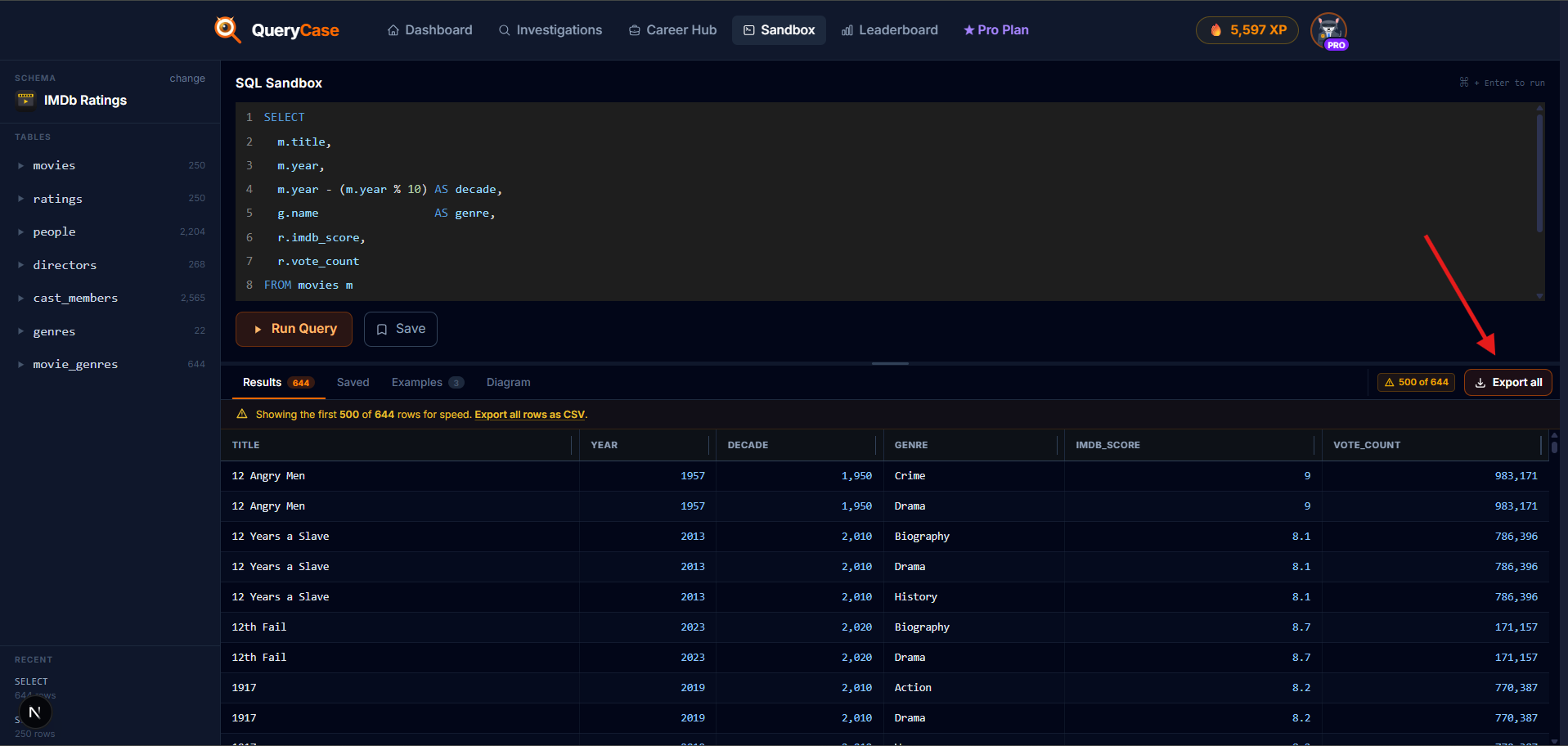
What it answers: genre is the one thing a film has many of, so it needs its own table with one row per film-and-genre. That lets Tableau count films per genre and average ratings by genre without double-counting.
SQL
SELECT
m.title,
m.year,
m.year - (m.year % 10) AS decade,
g.name AS genre,
r.imdb_score,
r.vote_count
FROM movies m
JOIN ratings r ON r.movie_id = m.movie_id
JOIN movie_genres mg ON mg.movie_id = m.movie_id
JOIN genres g ON g.genre_id = mg.genre_id
ORDERBY m.title, g.name;
What it does: this walks the bridge from movies to genres through the movie_genres link table. Because a film like The Dark Knight is Action, Crime and Drama, it appears three times here, once per genre. That is on purpose. You get 644 rows.
Export it as film_genres.csv.
Same flow for the genres query: run it, then Export CSV for film_genres.csv.
Step 3: The recurring faces
What it answers: which actors appear again and again across these great films, and how their films rate on average. One row per actor, for anyone in at least four of the 250.
SQL
SELECT
p.name AS actor,
COUNT(*) AS film_count,
ROUND(AVG(r.imdb_score), 2) AS avg_score,
MIN(m.year) AS first_film,
MAX(m.year) AS latest_film
FROM cast_members c
JOIN people p ON p.person_id = c.person_id
JOIN movies m ON m.movie_id = c.movie_id
JOIN ratings r ON r.movie_id = m.movie_id
GROUPBY p.person_id, p.name
HAVINGCOUNT(*) >= 4ORDERBY film_count DESC, avg_score DESC;
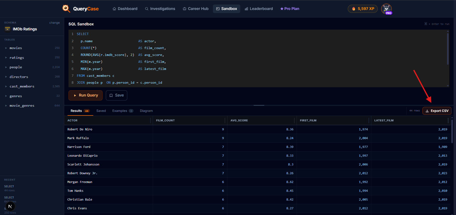
What it does: it joins the cast to the people and the films, groups by actor, and counts their appearances. HAVING COUNT(*) >= 4 keeps only the regulars. The result is a tidy leaderboard: Robert De Niro and Mark Ruffalo lead with nine films each, while Morgan Freeman's films carry the highest average score.
Export it as top_actors.csv. You now have all three files.
The actors leaderboard, ready to export as top_actors.csv.
Into Tableau: connect your data
Now you turn those three CSVs into a dashboard, all in the browser. Take it one step at a time.
1. Open the browser editor
Sign in to Tableau Public. In the top menu, click Create, then Web Authoring to build right in your browser. (If you would rather have more formatting control, you can download the free Tableau Public desktop app instead; it uses the same free account, and every step here works the same way.)
In Tableau Public, click Create and choose Web Authoring to build in your browser.
2. Upload your first CSV
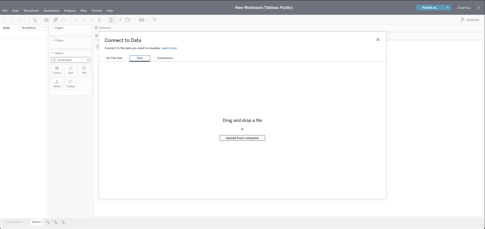
A Connect to Data window opens. Click the Files tab, then Upload from computer (or drag the file straight in), and choose films.csv. Tableau reads your columns automatically and drops you into the editor.
The Connect to Data window: open the Files tab and upload films.csv.
3. Add the other two as their own data sources
Now bring in the other two files. The important part, and the bit people get wrong: add each one as its own separate data source, not as an extra table or a union inside the films connection.
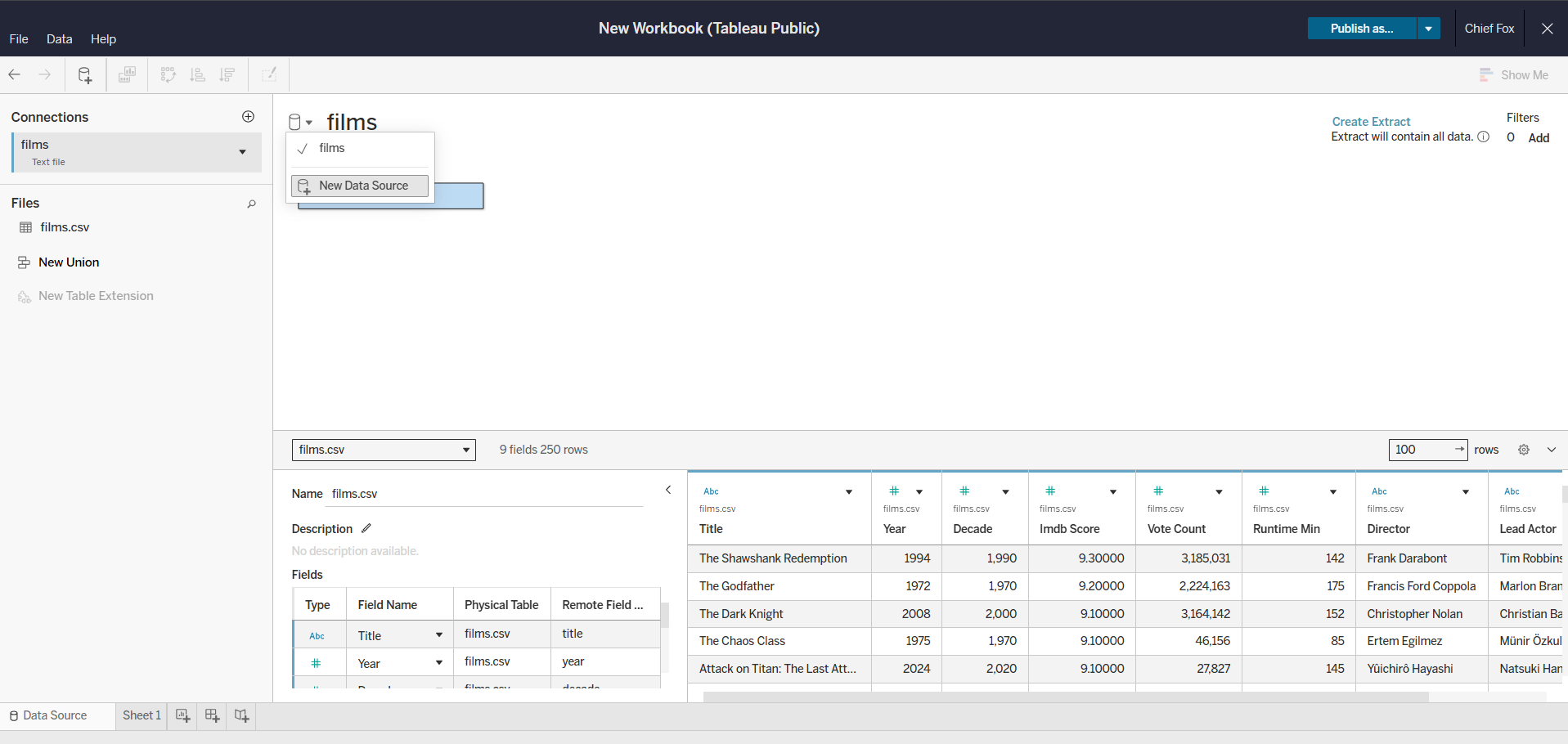
On the Data Source page (the tab at the bottom-left), click the small dropdown arrow next to the data source name and choose New Data Source. Upload film_genres.csv. Then do exactly the same again for top_actors.csv.
Click the dropdown by the data source name and choose New Data Source to add each file on its own.
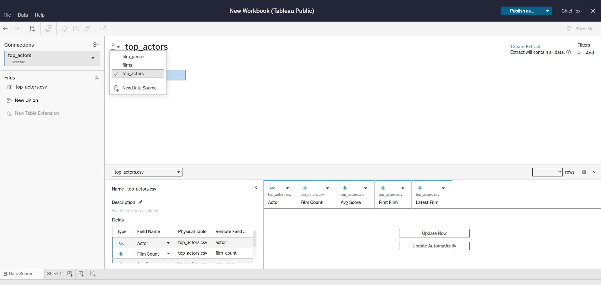
You will end up with three independent data sources. You can switch between them from that same dropdown, and each chart later just uses whichever one it needs.
The three CSVs as separate data sources: films, film_genres and top_actors.
One thing about Tableau Public
Each CSV is its own data source, so charts built from different files will not cross-filter each other automatically. For a first dashboard that is completely fine. If you want them linked later, you can relate film_genres back to films on title in Tableau's data model, but do not let that hold up version one.
Build it, chart by chart
Each sheet below is one new worksheet (the tabs along the bottom). Build them one at a time, then we will drop them onto a dashboard.
The headline numbers
The four tiles at the top are each a single number on its own worksheet. Watch one build, from the films source, then repeat the same moves for the other three:
Building the Average IMDb Score tile: drag the measure to Text, switch it to Average, hide the header, add a title, size the number up, and format it.
Only the field, the maths and the number format change from one tile to the next:
Tile
Drag this field
Set aggregation
Format
Average IMDb ScoreShown above
Imdb Score
Average
2 decimal places
Movie Count
Title
Count
Whole number
Avg Runtime
Runtime Min
Average
Whole number + " mins"
Total Votes
Vote Count
Sum
Thousands separator
drag the field onto the Text card, set its aggregation, hide the header, name the sheet, size the number up, and format it. That is the whole clip above, repeated four times.
Films by decade
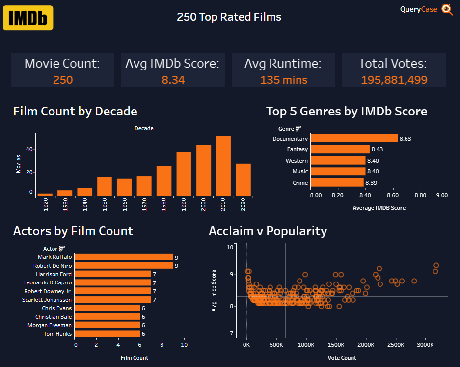
From the films source: Decade on Columns, count of films on Rows. The clip shows the build; the payoff is seeing which eras the canon leans on.
Films by decade: a simple count, sorted left to right along the timeline.
Acclaim vs popularity
The most revealing chart, and still on films: Imdb Score against Vote Count, one dot per film. It shows that acclaim and popularity are not the same thing. Drop Title, Director and the score onto the Tooltip so every point tells its story on hover.
A scatter of rating against votes, with a rich tooltip on each film.
Highest-rated genres
Switch to the film_genres source: average Imdb Score by Genre, sorted high to low. One row per film-genre keeps that average honest.
Average rating by genre, sorted highest first.
The recurring faces
From top_actors: Film Count by Actor, sorted down, with Avg Score on Colour, so you see who appears most and whose films rate best at once.
Actors by film count, coloured by their average film rating.
Assemble the dashboard
Create a new Dashboard (the icon beside the worksheet tabs) and set its size. Drag your sheets on: the four KPI tiles in a row across the top, the charts in a grid below. Switch an object to Floating when you want to place it exactly; leave it Tiled and Tableau keeps everything aligned for you.
Make it look the part
A considered-looking dashboard reads as more credible, and five quick moves do most of the work:
Set the background. Open Dashboard > Format and give the dashboard a single background colour (a dark navy or a clean off-white both work), so the tiles stand out against it.
Recolour the charts. Click a chart, open the Color card on the Marks shelf, and swap Tableau's default blue for a single accent colour, used consistently across every chart.
Strip the clutter. Right-click an axis and turn off gridlines, zero lines and rulers (Format > Lines), and hide any axis titles you do not need. Less ink, more signal.
Write real titles. Rename each sheet's title to the finding, not the formula: "Drama and crime rule the canon," not "AVG(Imdb Score) by Genre."
Format the numbers. Average ratings to two decimals, votes as "2.2M", runtimes with " mins". Right-click a measure and choose Format.
Design resources
Grab the IMDb logo to drop into your dashboard title, for a clean nod to the source.
Publish and share
Click Publish in the top bar and give your workbook a name. It saves to your Tableau Public profile and gives you a public URL. That link is the whole point: it is a live, interactive piece you can drop into a CV, a LinkedIn post or a portfolio, and anyone can open it without installing a thing. Here is the finished example from this walkthrough.
Take the challenge
The starter dashboard is exactly that: a start. The version worth showing off, and the one that teaches you the most, is the one you push past it. Take it further:
Add a chart of your own. A director leaderboard (count films per director from films.csv), a runtime distribution, or average rating by decade to see whether the greats cluster in one era.
Make it interactive. Add a decade or genre filter so a viewer can slice the whole dashboard, not just look at it.
Out-design it. Rework the layout, spacing and colours until it genuinely looks better than the starter. That polish is exactly what a portfolio piece is judged on.
A dashboard you can point to is worth ten you can only describe, and "I built this" is a far stronger thing to say in an interview than "I learned some SQL."
Show us what you built
Post your finished dashboard on LinkedIn and tag @QueryCase. We would love to see it, and we reshare the ones we love.
You just did the full loop a data analyst does every day: shape data with SQL, decide what each query answers, and communicate it visually. The SQL is the part that compounds, and the fastest way to get fluent is to keep writing it against data you actually care about.
That is what QueryCase is built for: guided cases that teach SQL as a detective story, drills between topics, and the same sandbox you just used, ready for your next question. Open the IMDb Ratings sandbox again and see what else the data will tell you.
Films by genre
Each film split across its genres, so genre comparisons stay fair.
film_genres.csv
Query 3
The recurring faces
The actors who appear most across these top-rated films.
top_actors.csv
The recipe for every tile:
Build an IMDb Movie Dashboard with SQL and Tableau (Free Beginner Project) | QueryCase